iHealth
Unified Care
OVERVIEW
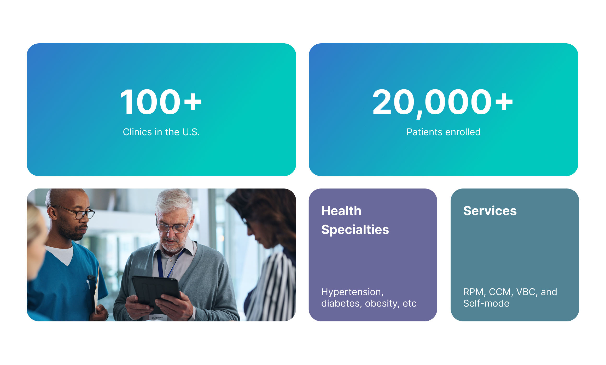
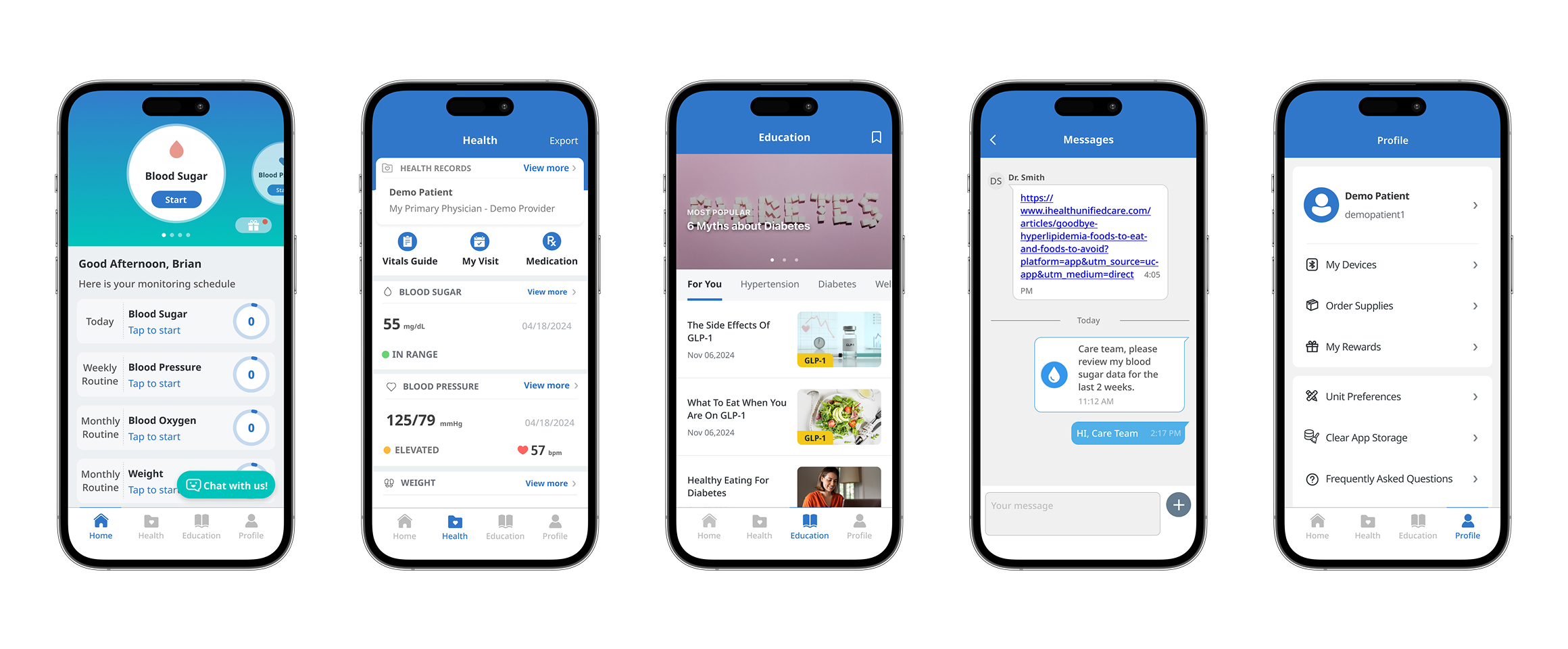
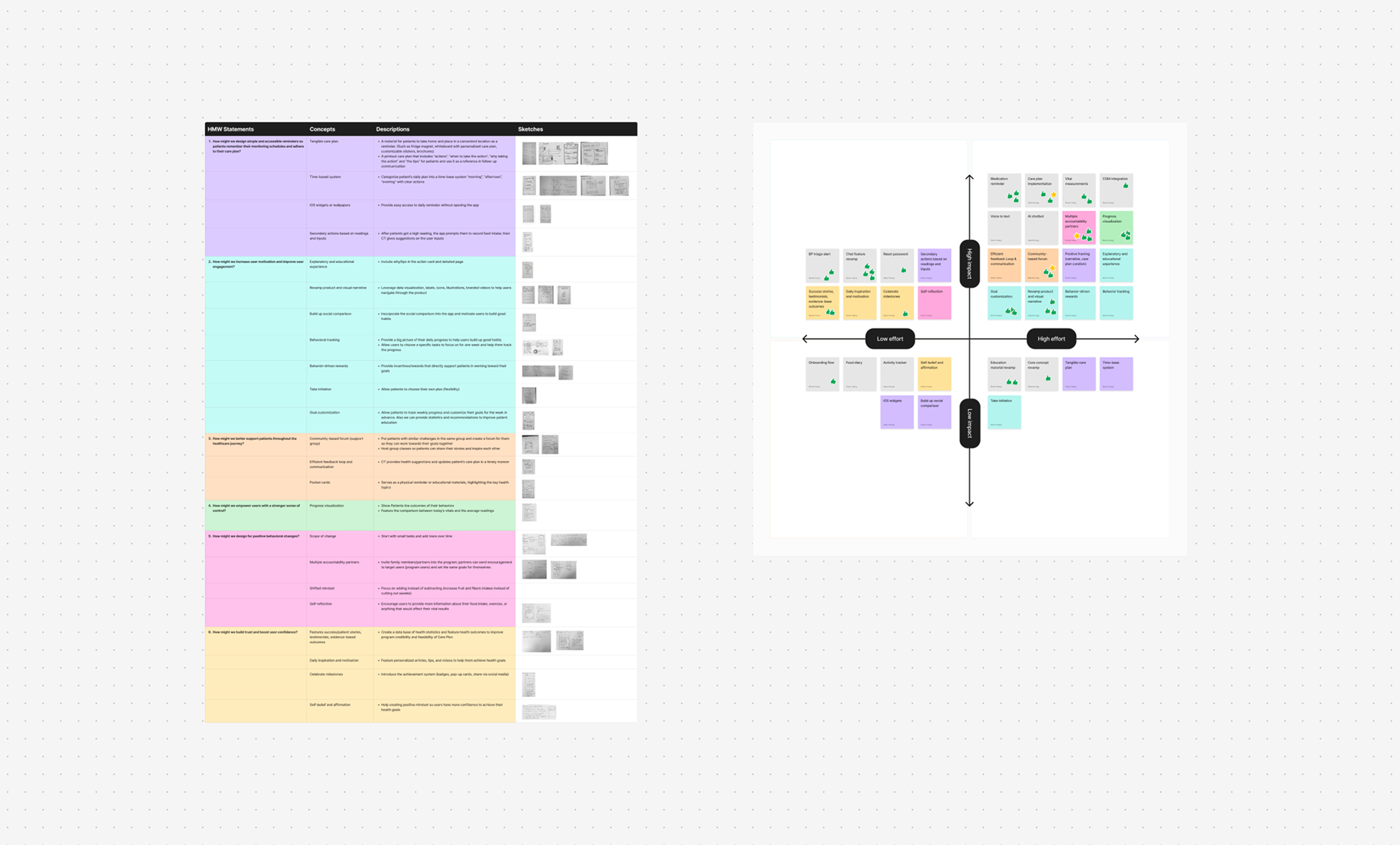
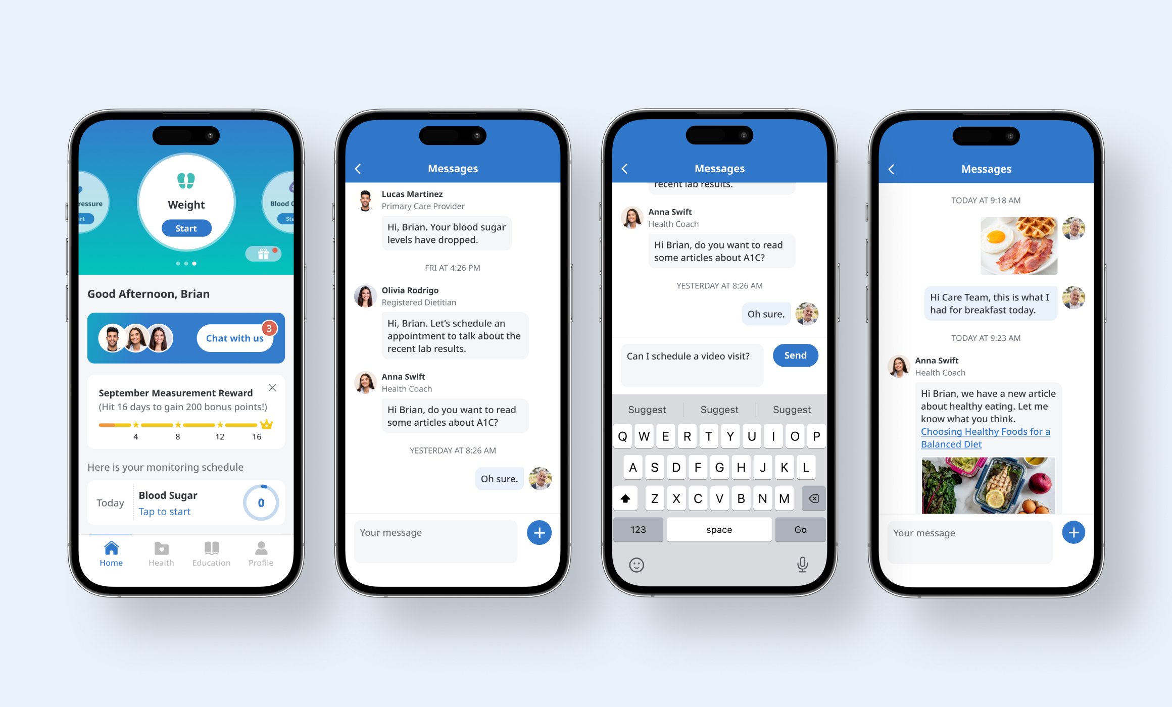
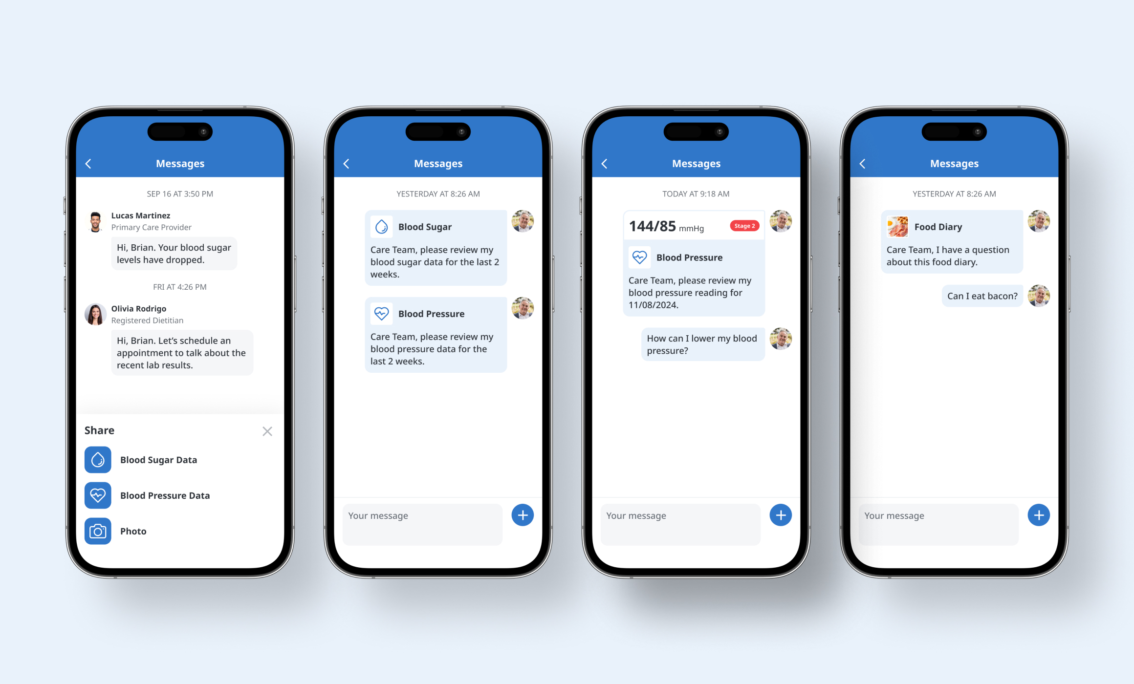
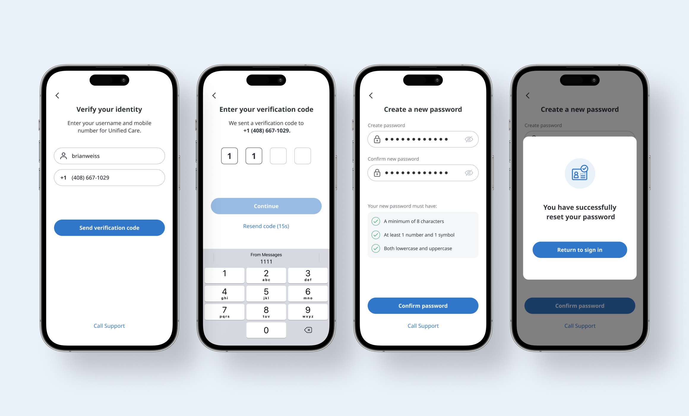
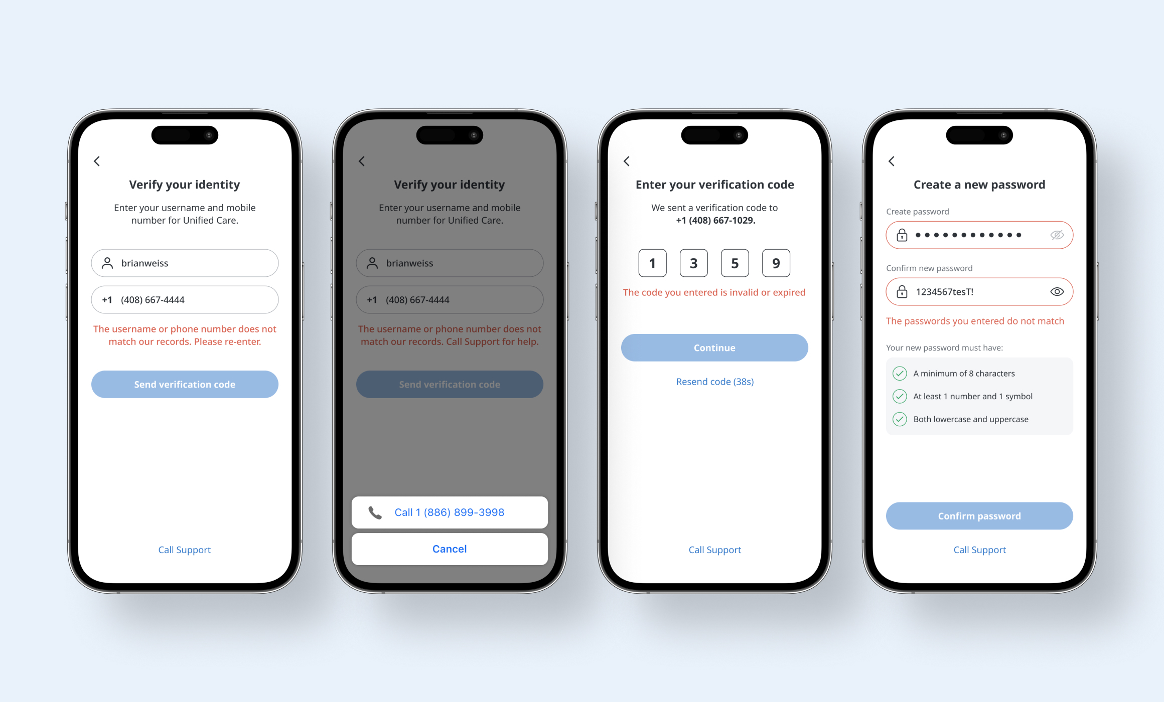
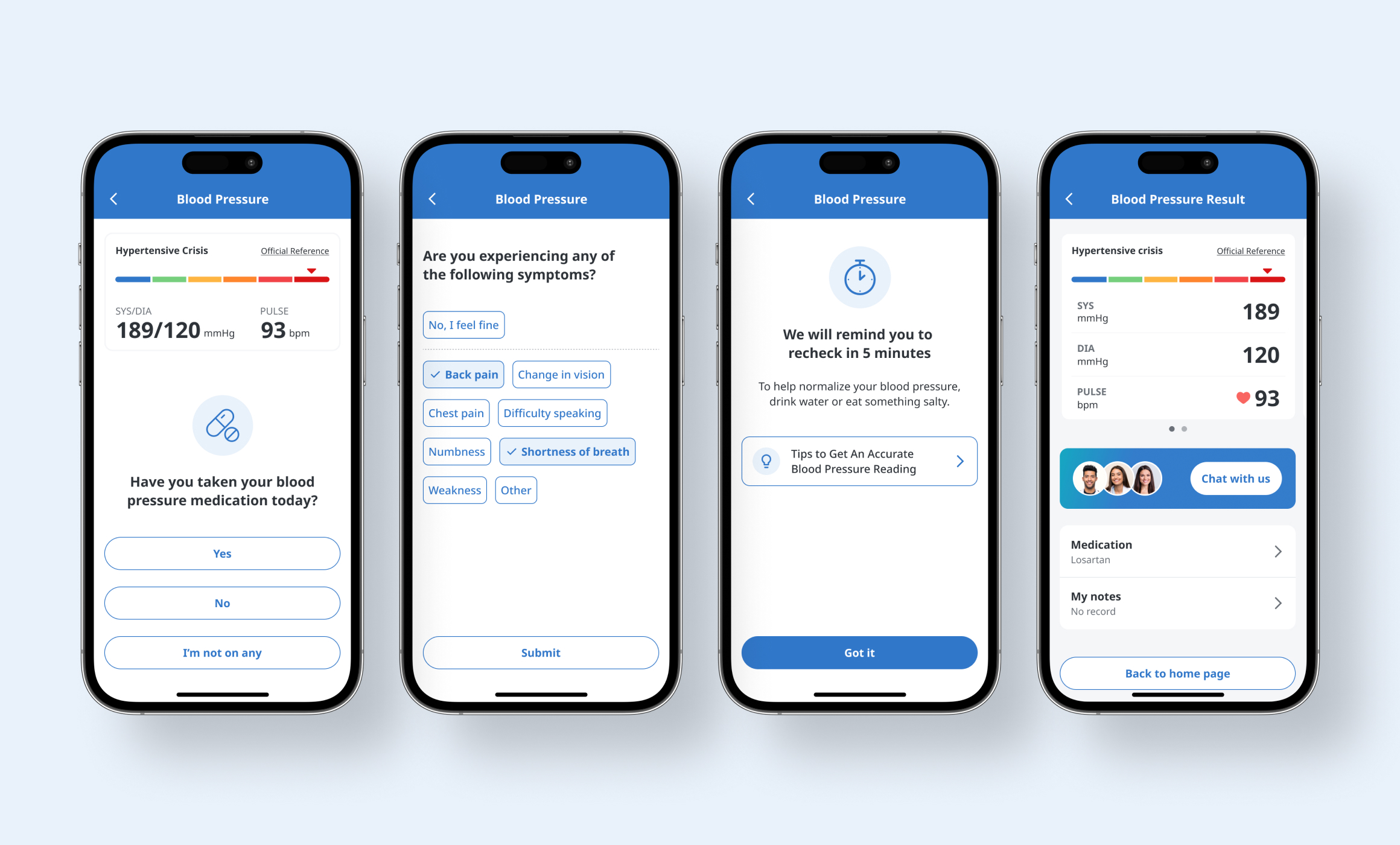
iHealth is a digital health company known for its COVID-19 test kits, monitoring devices, and the Unified Care program. The Unified Care program offers a patient-facing mobile app (B2C) and internal tools (B2B) that support remote patient care, improve health outcomes, and simplify clinical workflows for healthcare providers.
RESPONSIBILITY
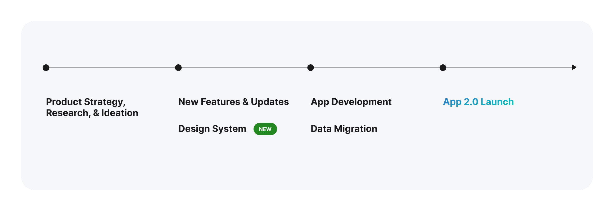
Research
Product Design
Web Design
Design System
Marketing Strategy
TEAM
Product Design
Product Managers
Developers
Care Team
Marketing & Sales